Like so many of its rivals and Stellantis stablemates, Citroën is looking to the past for inspiration as it navigates its electric future.
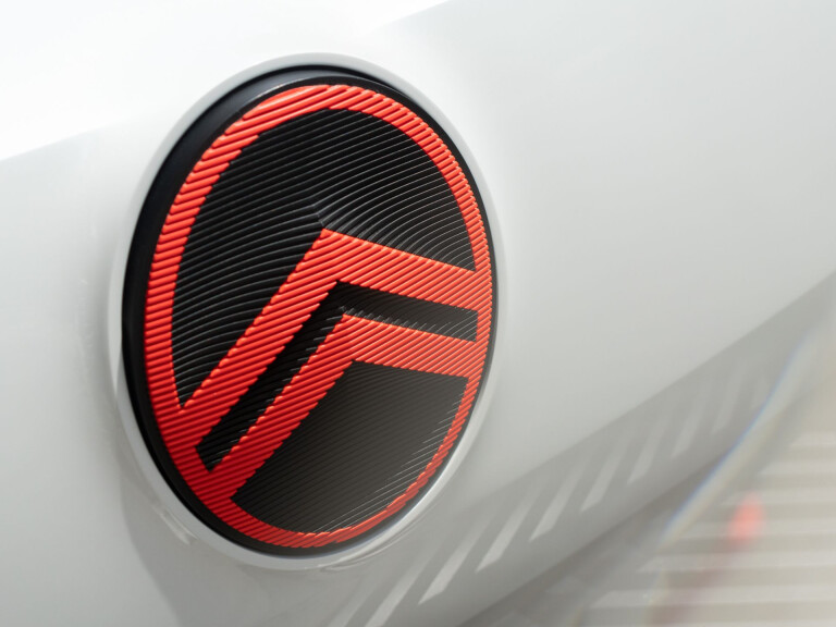
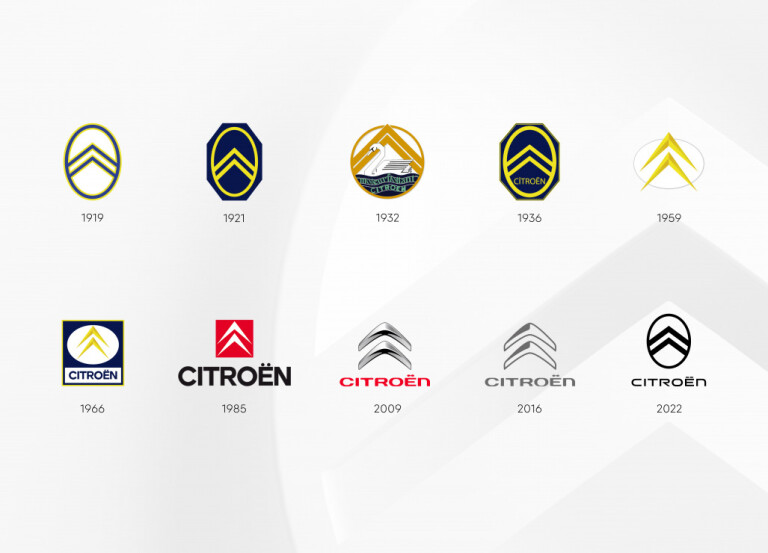
In the case of its brand and that iconic “deux-chevron”, Citroën has cast its vision back to the logo it launched with in 1919 – marking the 10th evolution of its badge in 103 years.
Interestingly, three of Citroën's printed logos – including this latest version – have been introduced in the past 13 years alone, with just seven- and six-year stints between them.

(How much cheaper could new cars be if brands weren't regularly budgeting for new branding across their offices, dealerships, stationery and workwear...)
Of course, the Citroën brand has kept up with graphic design trends through the 2000s and 2010s.
In 2009, Citroën revealed a curvaceous logo with subtle metallic tones through the chevrons – just like many of its rivals – before embracing the ‘flat’ design theme that had grown out of the online space, eventually affecting (infecting?) just about every industry in the world.

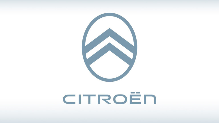
Now, in 2022, Citroën is again paring back what little complexity remained in its modern logos, returning the chevrons to their earliest, encircled look – inspired, by the way, not by military chevrons but rather by the herringbone pattern of the massive double helical gear design André Citroën had bought the rights to in the early 20th century.
“The elegant new emblem signposts the brand’s transition and evolution, and will debut at the end of September on a significant conceptual Citroën family vehicle," the company says.
"Versions of it will then progressively enhance future Citroën production and concept vehicles from mid-2023 on."

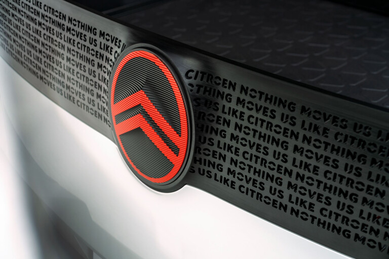
Citroën will also roll out a new slogan to accompany the new logo: “Nothing Moves Us Like Citroën”.
Watch for new Citroën cars to show their new chevrons in 2023.


COMMENTS